Year | 2022
Data Export
Data Export
Modal to support additional durations, timeframes and data types
Modal to support additional durations, timeframes and data types
STRAVA is a social fitness app that tracks activities via GPS, while its STRAVA | METRO program uses anonymized user data to help urban planners improve infrastructure and transportation.
STRAVA is a social fitness app that tracks activities via GPS, while its STRAVA | METRO program uses anonymized user data to help urban planners improve infrastructure and transportation.
STRAVA is a social fitness app that tracks activities via GPS, while its STRAVA | METRO program uses anonymized user data to help urban planners improve infrastructure and transportation.
STRAVA is a social fitness app that tracks activities via GPS, while its STRAVA | METRO program uses anonymized user data to help urban planners improve infrastructure and transportation.
Problem
Problem
Partners download the dataset after new monthly data is released. Data could only be downloaded as an entire file of the entire area, single edge or multiple edge batch.
Entire areas of interest (AOIs) were resource intensive on our end to compile and package.
Analysts would import the data set into third party software for further analysis.
The data outside of their much smaller area of study meant the majority of the data would be discarded. It was a waste of resources on our end and an extra step on their end to isolate the portion they were interested in.

Phase One
Timeframes
Timeframes
For the three month export option, we brainstormed how to display different timeframes. Will we use full quarters (Q1, Q2, etc), or allow partners to select up to 90 consecutive days of data?
This feature will reduce the number of clicks needed to export up to three months of data.
For the three month export option, we brainstormed how to display different timeframes. Will we use full quarters (Q1, Q2, etc), or allow partners to select up to 90 consecutive days of data?
This feature will reduce the number of clicks needed to export up to three months of data.
For the three month export option, we brainstormed how to display different timeframes. Will we use full quarters (Q1, Q2, etc), or allow partners to select up to 90 consecutive days of data?
This feature will reduce the number of clicks needed to export up to three months of data.

I started out by taking inventory of the current modal experience, a best practice from my time in technical support. By identifying the four different experiences, I wanted to simplify the changes so they could be applied to all situations.
I started out by taking inventory of the current modal experience, a best practice from my time in technical support. By identifying the four different experiences, I wanted to simplify the changes so they could be applied to all situations.

If we’re going to add time frames, let’s start by looking at the different ways to pick a frame of time. The drop down menu was already used to filter time and I wanted to maintain familiar selection tools when it made sense. For this update, it did not make sense to use the drop down when including the new options. I broke month and year into two separate selections to prevent covering too much of the text below.
Screens
Screens
The initial goal of the project was to support a three month export. Unfortunately, I didn't fully understand the goal was to ADD a three month option to the existing one month option. Thankfully, design review caught my error during in the my first pass.
We highlighted an opportunity for improving the UX by pre-populating the date range from the selection made in the visualizer, rather than defaulting to January and asking the Partner to make the selection again in the modal.


The following revision addressed the one and three month selection options. I explored different selection UI - radio buttons vs. a dropdown menu but did not pursue it further as it would need to be redesigned if we added additional time frames in the future.

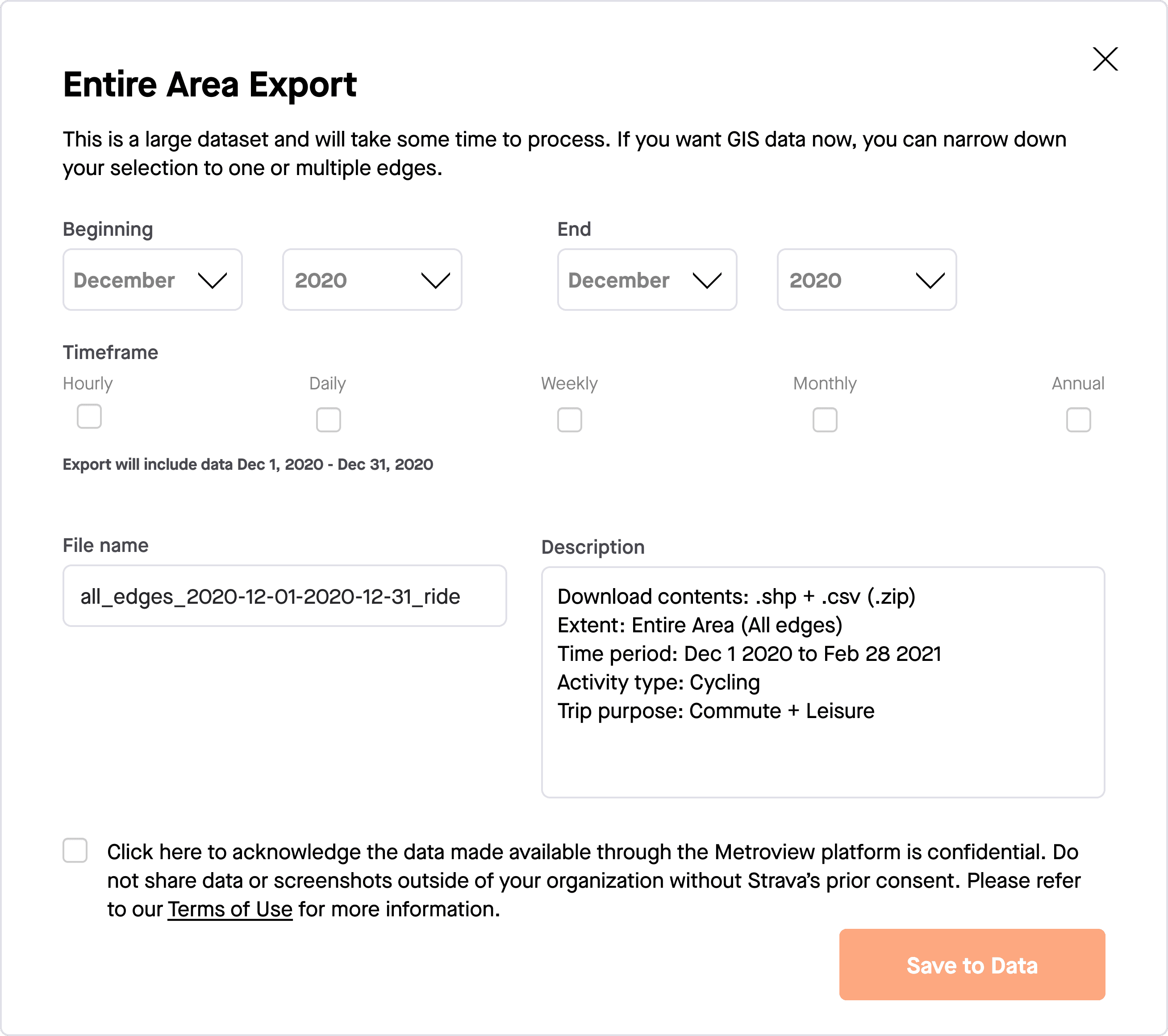
Download contents and File name fields were also a concern for our PM. They raised the point if a Partner has a large quantity of data files downloaded from us, the more we can do to differentiate them for at a glance interpretation, the better, and reinstated the Time Period field.
I’ve grouped the selections at the top of the modal after we confirmed we were able to update the name and descriptions fields automatically - they were no longer static text strings. Titling was also added to differentiate different use cases (edge vs AOI). A summary caption was added to confirm the data selection. Messaging added at the bottom of the modal set expectations as well as providing a workaround if they wanted data sooner.

Adding edge case detection and correction links to improve user experience. Messaging was moved to the top of the modal as subheading text. We added a checkbox to remind the Partner that data was not to be shared without STRAVA’s approval.
Phase Two
Periodicities
Use case: A lot of Partners are doing 2020 year end maps and running into issues with downloading the data one month at a time and validating the data using third party software.
Goal: Design the interface for users to choose the timeframe and periodicity of data they want to export (multiselect, checkboxes, etc for different timeframes).
I learned a lot on this one - what the hell the word periodicities meant, how these types of data differ and what their use is to our Partners. I needed to visualize the differences for myself to better understand how to display them to Partners. I did not come from a transportation planning background and needed to familiarize myself with the terminology in order to display it visually.
Initial sketch of web app and data download modal. I experimented with icons for the different periodicities, but didn't find any use for them beyond helping me better understand how the data differed.
Screens
My first design pass was to group similar information. Drop down selections with drop down selections and text fields with text fields. Adding a pop out modal to the existing modal was one way to achieve this.
The second iteration went to a two column view (sort of - with the Timeframe being full width). Having a pop out modal added an extra click, which was exactly the thing I was trying to avoid.
I’d changed the periodicity selection from a dropdown to checkboxes to support multiple exports.
The second iteration went to a two column view (sort of - with the Timeframe being full width). Having a pop out modal added an extra click, which was exactly the thing I was trying to avoid.
I’d changed the periodicity selection from a dropdown to checkboxes to support multiple exports.
The second iteration went to a two column view (sort of - with the Timeframe being full width). Having a pop out modal added an extra click, which was exactly the thing I was trying to avoid.
I’d changed the periodicity selection from a dropdown to checkboxes to support multiple exports.

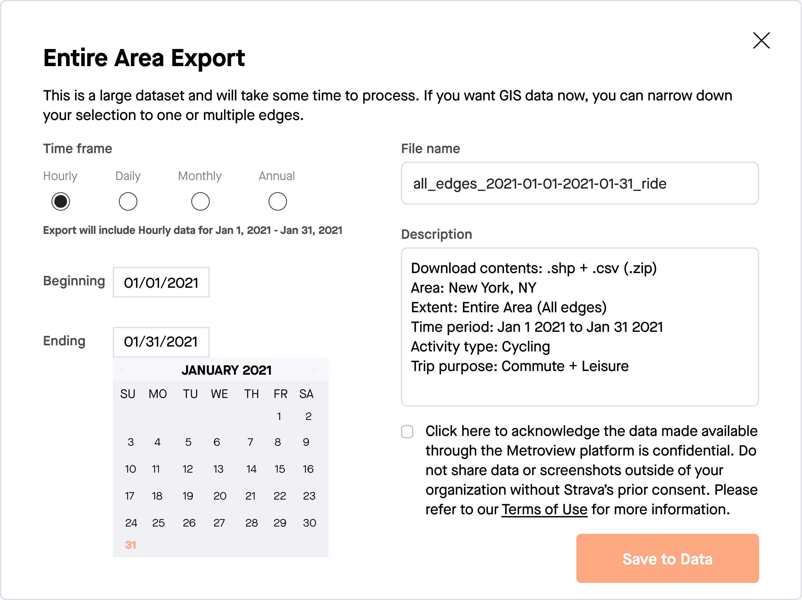
My third pass regrouped selection inputs on the left and text on the right. Selections in the left panel would automatically update the text on the right where no input was required.
Periodicities were grouped with the input selections column which reduced the spacing.
My third pass regrouped selection inputs on the left and text on the right. Selections in the left panel would automatically update the text on the right where no input was required.
Periodicities were grouped with the input selections column which reduced the spacing.
My third pass regrouped selection inputs on the left and text on the right. Selections in the left panel would automatically update the text on the right where no input was required.
Periodicities were grouped with the input selections column which reduced the spacing.
The shipped version - Checkboxes were changed to radio buttons as only one periodicity could be exported at a time.
We used the subheading text to inform Partners of a change to the file structure and linked out to our Knowledge Base article for the full explanation.
Beginning and Ending dropdowns were swapped out for calendar selections.
Results
Things I am proud of
Proud moments
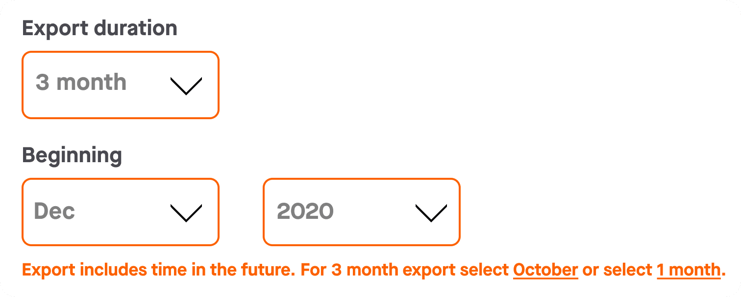
Turning a error message into a single click resolution by adding linked text to the message both informs the user with plain language and what options they have to resolve it rather than send them back to make new selections.
Ambiguous, unhelpful error messages don't give the user anything to act on. Telling them what the error is, but returning them to the selection options to correct the error puts the effort back on the user.
Clarifying copy for non-technical users. While Metro users are usually familiar with common industry terms like 'periodicities', using plain language future proofs the design for non-technical users.
Clarifying copy for non-technical users. While Metro users are usually familiar with common industry terms like 'periodicities', using plain language future proofs the design for non-technical users.
Clarifying copy for non-technical users. While Metro users are usually familiar with common industry terms like 'periodicities', using plain language future proofs the design for non-technical users.
See more Case Studies
©2024 SEAN COURTNEY