Year | 2022
Origins &
Destinations
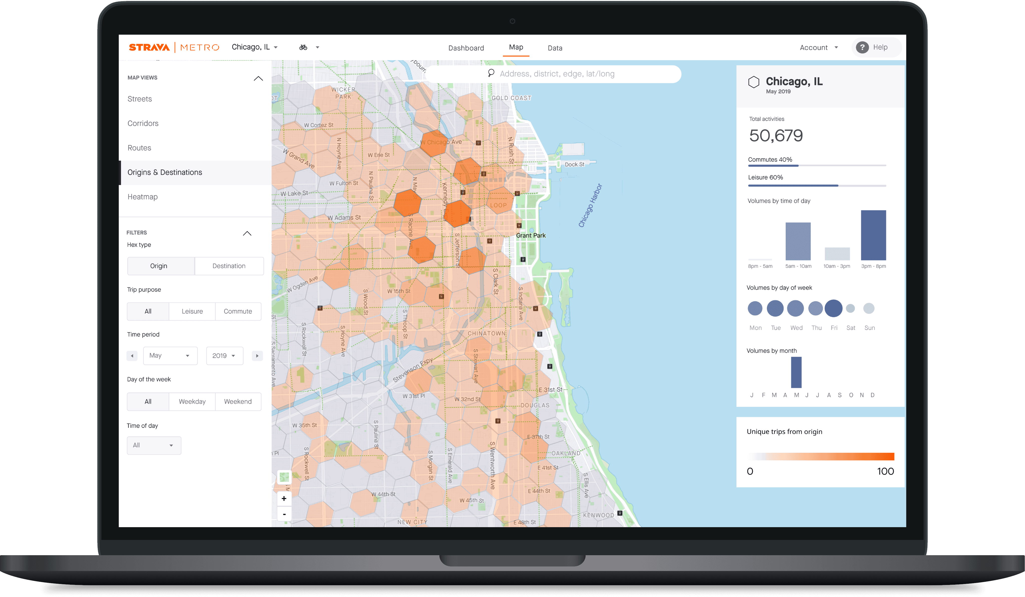
A heatmap of GPS activities start and end points for transportation planners.
+2%
Highest MAU to date
0
Support Tickets
Impact
STRAVA is a social fitness app that tracks activities via GPS. STRAVA | METRO uses anonymized user data to help urban planners improve infrastructure and transportation.
STRAVA is a social fitness app that tracks activities via GPS. STRAVA | METRO uses anonymized user data to help urban planners improve infrastructure and transportation.
So what's the problem?
Transportation planners need more context (data) to better understand how people use bike networks.
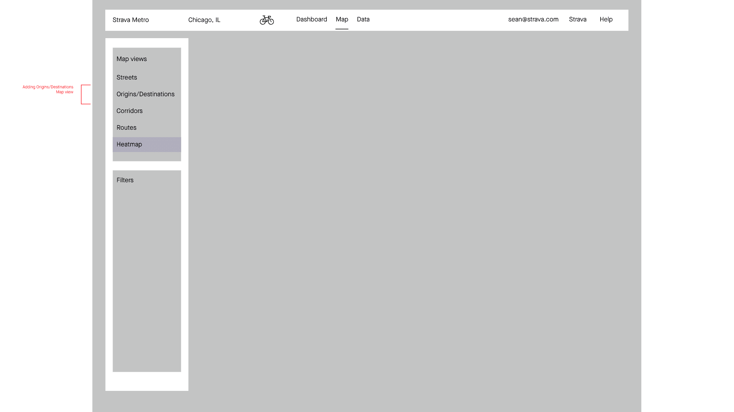
Similar to counting traffic manually with a counter, the Metroview web app only showed a single snapshot of a STRAVA user’s trip when they passed through a single location. Origins and Destinations added functionality to show start and end points of trips.
Transportation planners need more context (data) to better understand how people use bike networks.
Similar to counting traffic manually with a counter, the Metroview web app only showed a single snapshot of a STRAVA user’s trip when they passed through a single location. Origins and Destinations added functionality to show start and end points of trips.
Process…
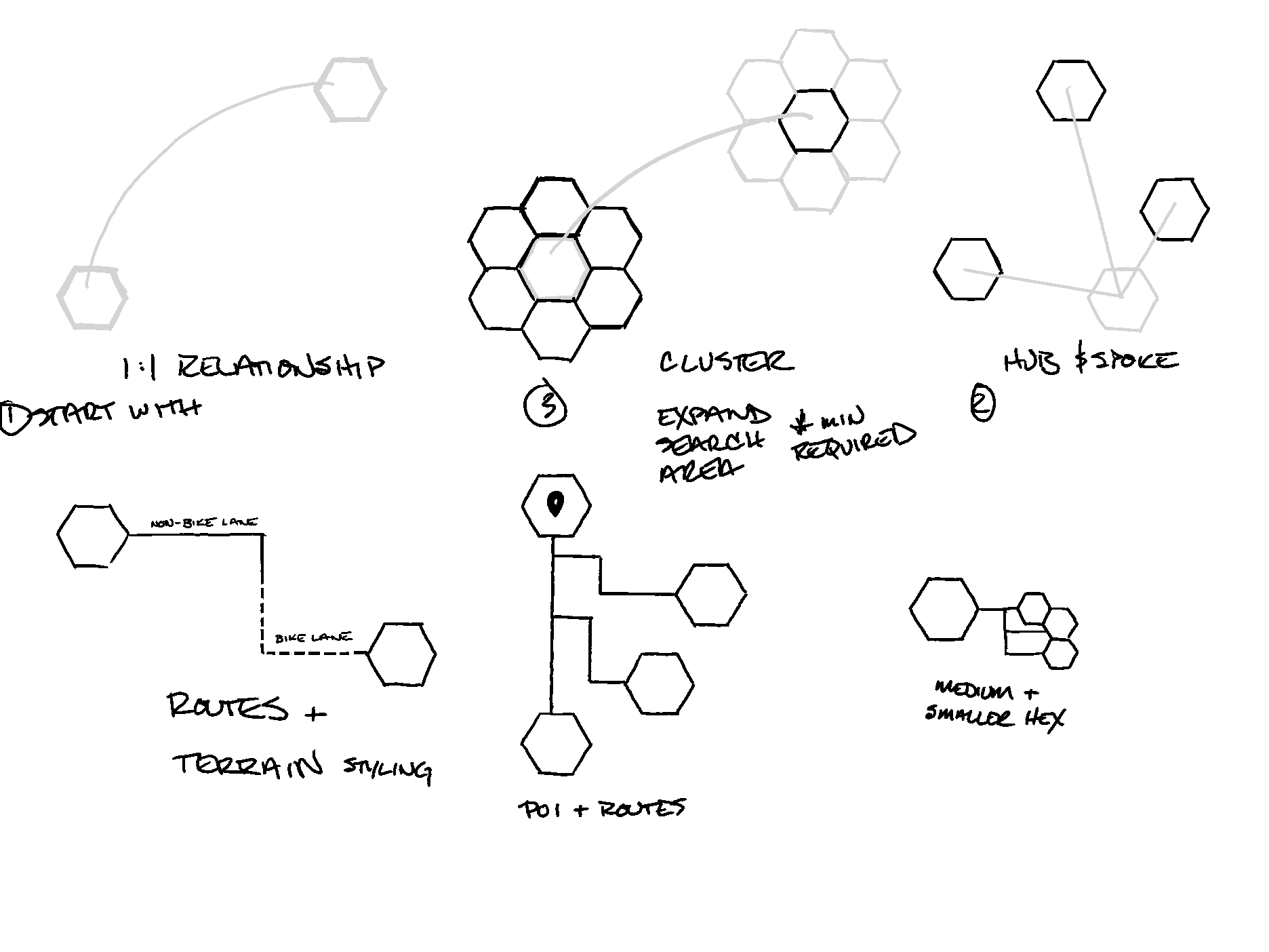
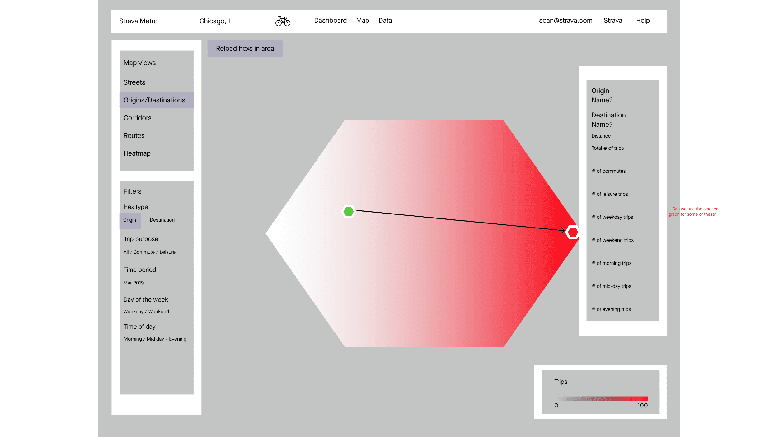
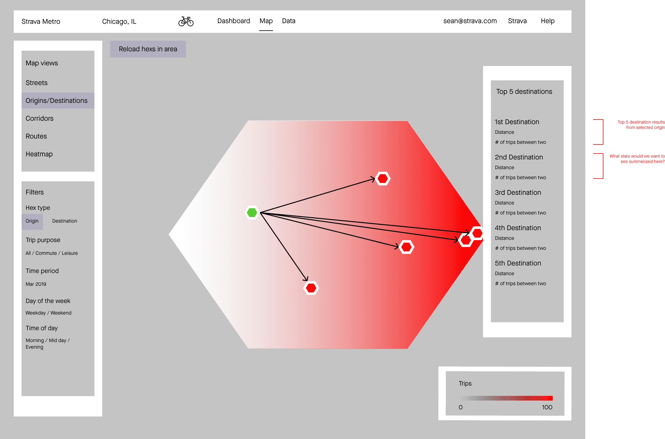
Early sketches explored visualizing different types of relationships between hexes. A line had been used to display a relationship between two hexagons, but as iterations continued, I removed it because it didn't represent the data we were showing.
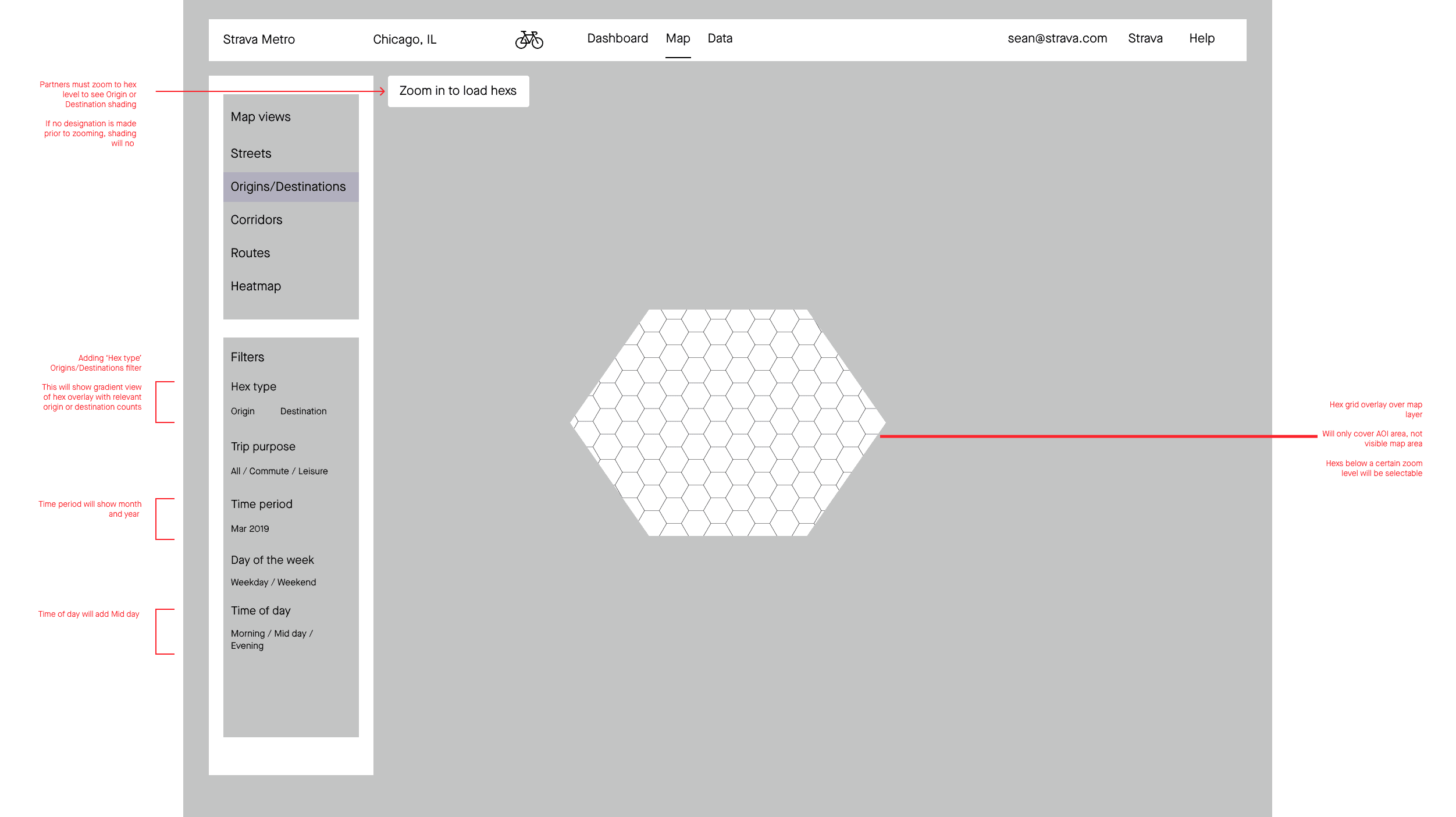
One early takeaway: the map gets very busy when trying to show start/end relationships at higher zoom levels.
Early sketches explored visualizing different types of relationships between hexes. A line had been used to display a relationship between two hexagons, but as iterations continued, I removed it because it didn't represent the data we were showing.
One early takeaway: the map gets very busy when trying to show start/end relationships at higher zoom levels.
Product requirements and technical implementation had been decided upon before I started work on this project.
Our engineering team was going to use Uber's H3 Hexagonal Hierarchical Spatial Index to organize and display the dataset.
I wanted to start my discovery work by viewing how other sites and services were using H3 to display different types of data and relationships.
…Process…
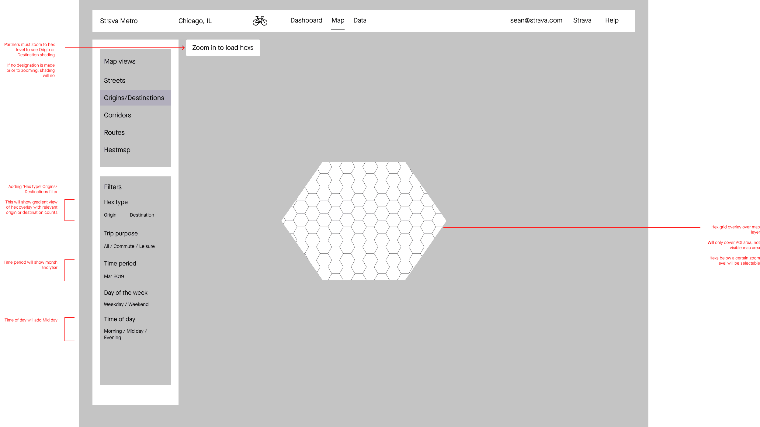
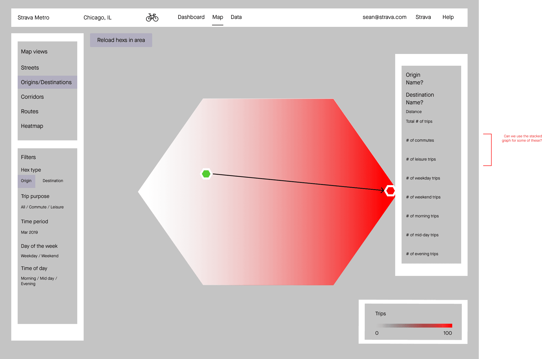
Keeping clicks to a minimum was my focus. Filter selections contained five options. Selecting the hex should only be two: one origin and one destination.
Prototyping and user flows helped identify which buttons and data modals would be shown on different selection pages.
Keeping clicks to a minimum was my focus. Filter selections contained five options. Selecting the hex should only be two: one origin and one destination.
Prototyping and user flows helped identify which buttons and data modals would be shown on different selection pages.
Rather than jumping into high fidelity prototypes - I started working through the user journey in low fidelity. How can I preserve familiar interactions so it fits within the product?

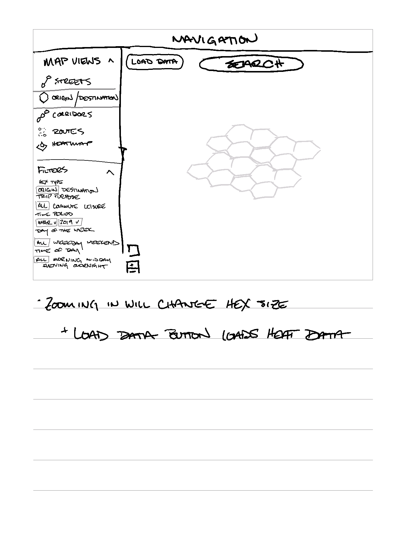
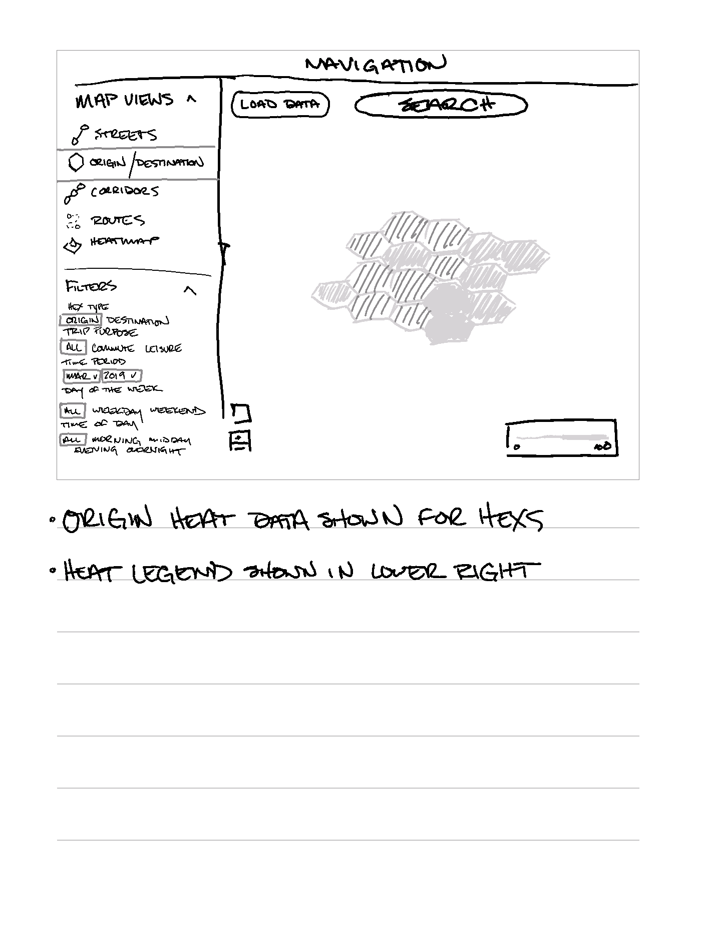


As I added more fidelity, I could question the information architecture and how it fits within the current product.
Data filters and
Top Destinations
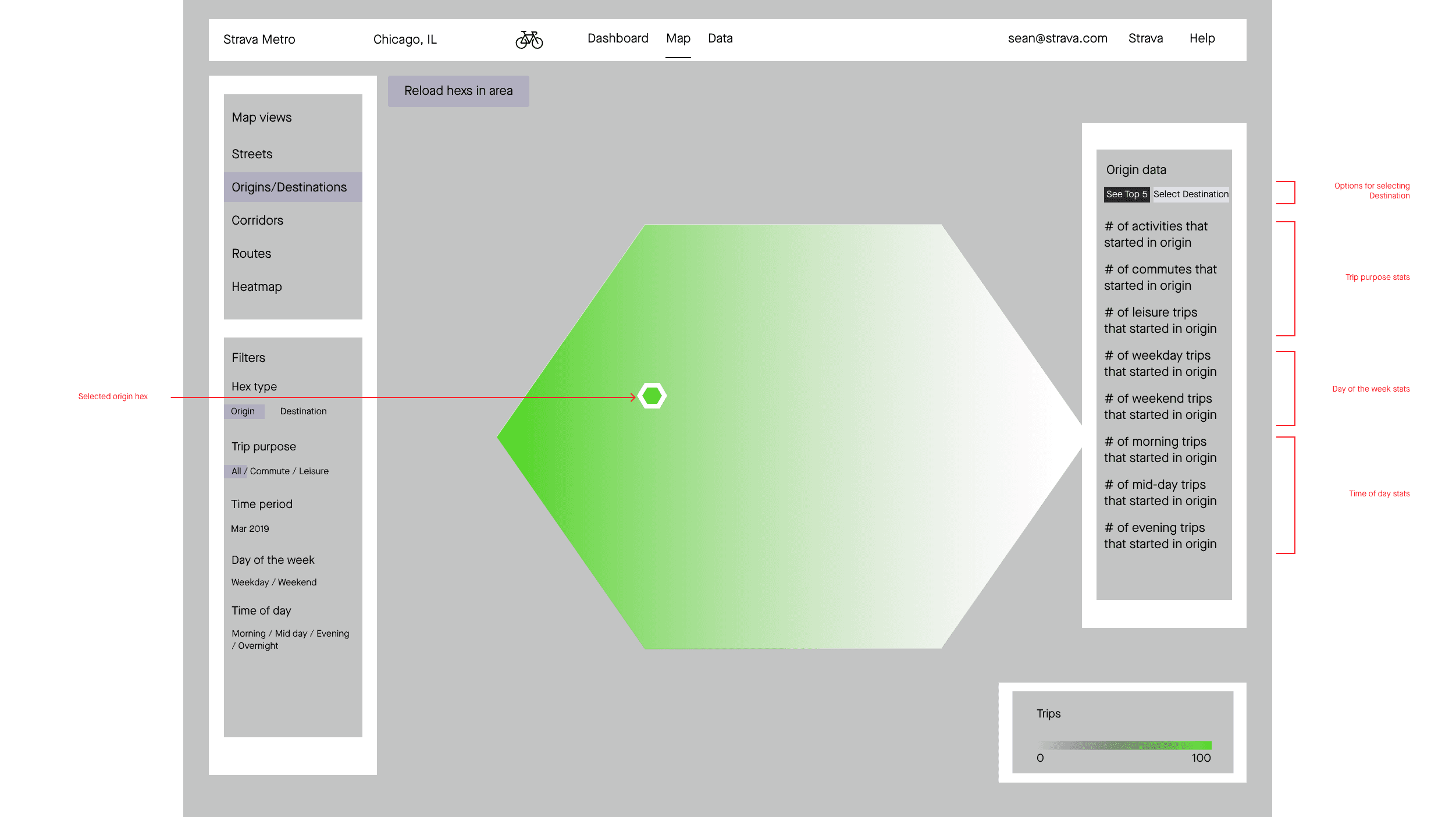
Summary data provides a deeper visual tool for Partners. Along with the choropleth tiles showing heat on the map, Partners can view different data types in the graphs. Breakdowns help filter data for non-downloaders who are not performing additional analytics.
Summary data provides a deeper visual tool for Partners. Along with the choropleth tiles showing heat on the map, Partners can view different data types in the graphs. Breakdowns help filter data for non-downloaders who are not performing additional analytics.

Left navigation panel housed the map views and data filter selections. We added an additional colorized outline to the Origins/Destination selection to highlight which is being selected.
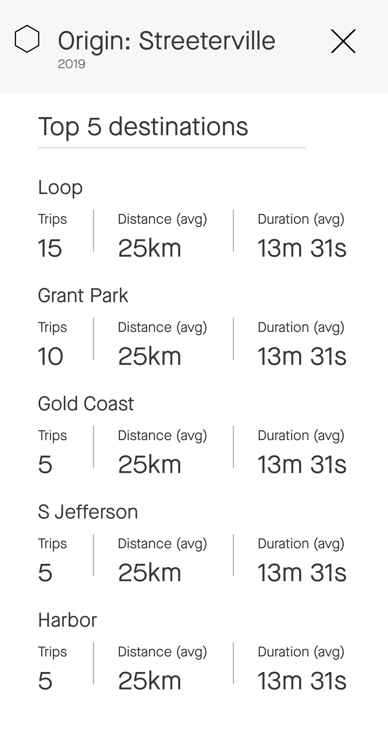
We started with a 'Top 5' list of hexes that had the most trips between them. But why limit it to five? After data was available for testing, we'd seen more than five
Color vision deficiency testing
We used the blue/red color combination because it had the most contrast. However, during testing, I noticed this combination fails to display contrast if the Partner experiences Protanopia. We’d worked through multiple other combinations until arriving at orange/purple as it retained enough contrast to display both colors simultaneously.
Once a tile is selected, the tile is outlined with the selection color (orange = Origin, purple = Destination). Without contrasting colors, the partner would be unable to differentiate the selected tile from the other tiles.
Data modal
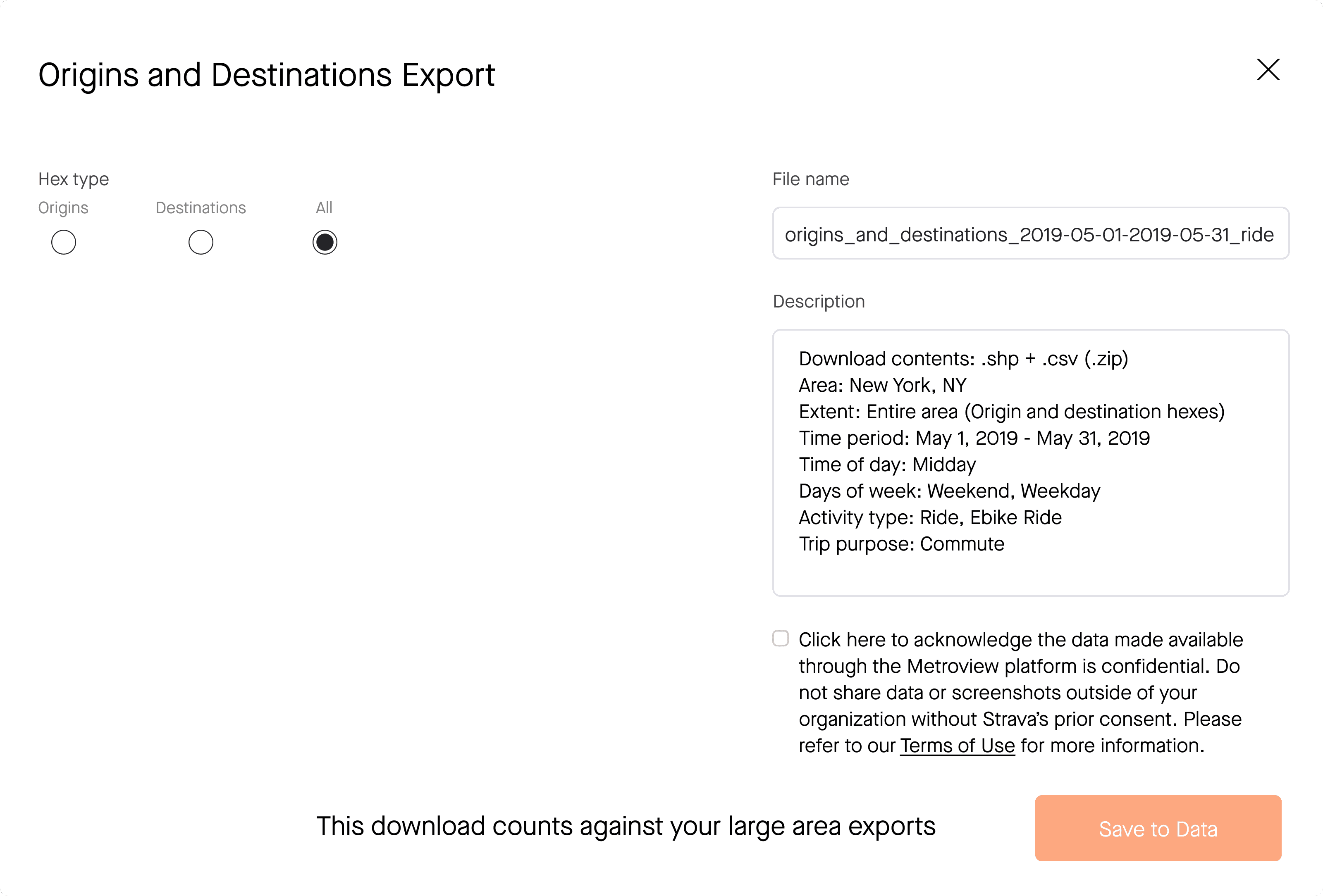
Allowing Partners to download the Origins and/or Destinations data was a surprise add on at the end of the project. I’d be designing the feature as a visual tool without the ability to download the data.
Allowing Partners to download the Origins and/or Destinations data was a surprise add on at the end of the project. I’d be designing the feature as a visual tool without the ability to download the data.
Results
Our primary KPI was increasing MAU. The month following the feature release combined with our email marketing campaign, we had the highest MAU of the Metro product.
Our primary KPI was increasing MAU. The month following the feature release combined with our email marketing campaign, we had the highest MAU of the Metro product.
See more Case Studies
Proud moments
Removing the "as-the-crow-flies" line connecting the two hexs. It didn't add more context or information and simplified the map view.
Incorporating more of the Strava brand into Metro - aligning Metro with the Strava consumer app by using Brand Guidelines and color palate strengthened the overall product offering.
Color vision deficiency testing - discovering the working color choices (blue/red) we'd been using during testing we're not accessible. It was a good reminder that conducting accessibility testing uncovers UX improvements outside of UI and flow work.
Learnings
Remove color highlight in Filters - shading is a sufficient method for indicating the selection state. Our team wanted to add the color stoke to make it extra clear which selection (Origin or Destination) was being shown on the map.
Remove color highlight in Filters - shading is a sufficient method for indicating the selection state. Our team wanted to add the color stoke to make it extra clear which selection (Origin or Destination) was being shown on the map.
Continue color vision testing and balance tradeoffs - We went nuclear and chose colors that had the best applicability for all users. Don't get me wrong - I think the best design solutions should be for everyone, but felt there was more opportunity to explore other combinations and weigh the tradeoffs.
Continue color vision testing and balance tradeoffs - We went nuclear and chose colors that had the best applicability for all users. Don't get me wrong - I think the best design solutions should be for everyone, but felt there was more opportunity to explore other combinations and weigh the tradeoffs.
If I had a more time
Add routing between Origin and Destination - My "ah-ha" moment during this project. Combining the existing Routes map view that could show Popular and Direct routes between two points with additional bike infrastructure data from OSM would highlight gaps in bike networks and opportunities to investigate sections of networks that were not being used.
Repurposing existing polyline treatments from the core Strava Route planning product, it could further strengthen the brand connection between Strava and Strava Metro.
This functionality was a use case that was surfaced to me by conducting user interviews.
©2024 SEAN COURTNEY
Origins &
Destinations
A heatmap of GPS-based activity start and end points for transportation planners.
Year | 2022
Year | 2022
Origins &
Destinations
A heatmap of GPS-based activity start and end points for transportation planners.
Impact
+2 %
All time high MAU
All time high MAU
0
0
Support Tickets
Support Tickets
STRAVA is a social fitness app that tracks activities via GPS. STRAVA | METRO uses anonymized user data to help urban planners improve infrastructure and transportation.
STRAVA is a social fitness app that tracks activities via GPS. STRAVA | METRO uses anonymized user data to help urban planners improve infrastructure and transportation.
So what's the problem?
Transportation planners need more context (data) to better understand how people use bike networks.
Similar to counting traffic manually with a counter, the Metroview web app only showed a single snapshot of a STRAVA user’s trip when they passed through a single location. Origins and Destinations added functionality to show start and end points of trips.
Process…
Product requirements and technical implementation had been decided upon before I started work on this project.
Our engineering team was going to use Uber's H3 Hexagonal Hierarchical Spatial Index to organize and display the dataset.
I wanted to start my discovery work by viewing how other sites and services were using H3 to display different types of data and relationships.

Early sketches explored visualizing different types of relationships between hexes. A line had been used to display a relationship between two hexagons, but as iterations continued, I removed it because it didn't represent the data we were showing.
One early takeaway: the map gets very busy when trying to show start/end relationships at higher zoom levels.
…Process…
… Process …
Keeping clicks to a minimum was my focus. Filter selections contained five options. Selecting the hex should only be two: one origin and one destination.
Prototyping and user flows helped identify which buttons and data modals would be shown on different selection pages.
Keeping clicks to a minimum was my focus. Filter selections contained five options. Selecting the hex should only be two: one origin and one destination.
Prototyping and user flows helped identify which buttons and data modals would be shown on different selection pages.
Rather than jumping into high fidelity prototypes - I started working through the user journey in low fidelity.
How can I preserve familiar interactions so it fits within the existing map views?


As I added more fidelity, I could question the information architecture and how it fits within the current product.
As I added more fidelity, I could question the information architecture and how it fits within the current product.
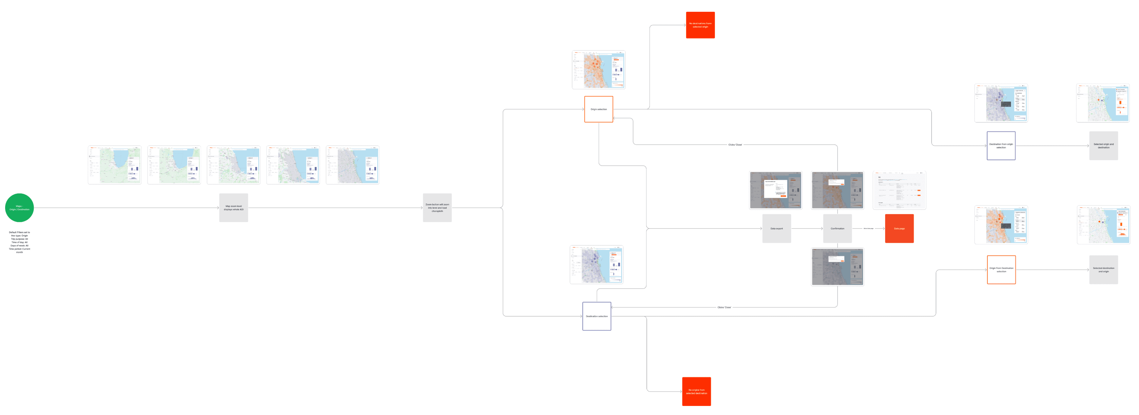
Laying out the user flow with screenshots helped my teammates visualize the progression better than only showing boxes and arrows
Laying out the user flow with screenshots helped my teammates visualize the progression better than only showing boxes and arrows.
Data filters and Top Destinations
Summary data provides a deeper visual tool for Partners. Along with the choropleth tiles showing heat on the map, Partners can view different data types in the graphs. Breakdowns help filter data for non-downloaders who are not performing additional analytics.
Summary data provides a deeper visual tool for Partners. Along with the choropleth tiles showing heat on the map, Partners can view different data types in the graphs. Breakdowns help filter data for non-downloaders who are not performing additional analytics.
Left navigation panel housed the map views and data filter selections. We added an additional colorized outline to the Origins/Destination selection to highlight which is being selected.

We started with a 'Top 5' list of hexes that had the most trips between them. After data was available for testing, were able to show all Top Results without a delay in load time.
Color vision deficiency testing
We used the blue/red color combination because it had the most contrast. However, during testing, I noticed this combination fails to display contrast if the Partner experiences Protanopia. We’d worked through multiple other combinations until arriving at orange/purple as it retained enough contrast to display both colors simultaneously.
We used the blue/red color combination because it had the most contrast. However, during testing, I noticed this combination fails to display contrast if the Partner experiences Protanopia. We’d worked through multiple other combinations until arriving at orange/purple as it retained enough contrast to display both colors simultaneously.
The design tradeoff here was solving a contrast issue that affected approximately 1 in 200 people versus 1 in 30,000 people worldwide. It was an opportunity to strengthen the Strava brand color within the Metro product.
Data modal
Allowing Partners to download the Origins and/or Destinations data was a surprise add on at the end of the project. I’d be designing the feature as a visual tool without the ability to download the data.
Allowing Partners to download the Origins and/or Destinations data was a surprise add on at the end of the project. I’d be designing the feature as a visual tool without the ability to download the data.

Results
Our primary KPI was increasing MAU. The month following the feature release combined with our email marketing campaign, we had the highest MAU in the product's history.
Our primary KPI was increasing MAU. The month following the feature release combined with our email marketing campaign, we had the highest MAU in the product's history.
Proud moments
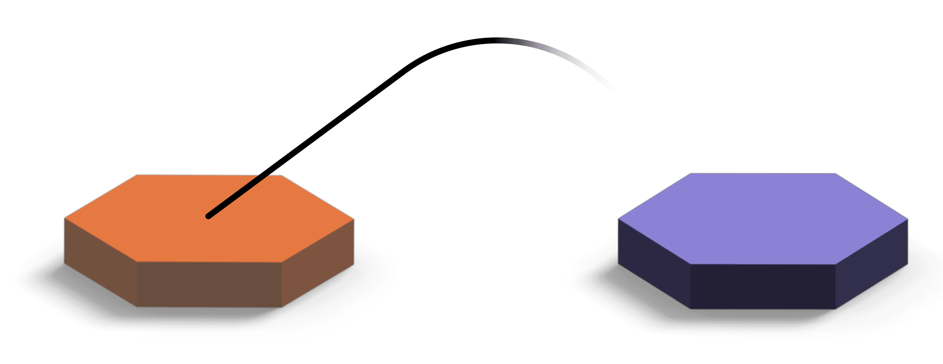
Removing the "as-the-crow-flies" line connecting the two hexs. It didn't add more context or information and simplified the map view.
Removing the "as-the-crow-flies" line connecting the two hexs. It didn't add more context or information and simplified the map view.
Incorporating more of the Strava brand into Metro - aligning Metro with the consumer app by using Strava's Brand Guidelines and color palate strengthened brand awareness.
Incorporating more of the Strava brand into Metro - aligning Metro with the consumer app by using Strava's Brand Guidelines and color palate strengthened brand awareness.
Color vision deficiency testing - discovering the working color choices (blue/red) we'd been using during testing we're not accessible. It was a good reminder that conducting accessibility testing uncovers UX improvements outside of UI and flow work.
Color vision deficiency testing - discovering the working color choices (blue/red) we'd been using during testing we're not accessible. It was a good reminder that conducting accessibility testing uncovers UX improvements outside of UI and flow work.
Learnings
Remove color highlight in Filters - shading is a sufficient method for indicating the selection state. Our team wanted to add a colorized outline to the button to make it extra clear which selection (Origin or Destination) was being shown on the map. We don't do this for any other filter selection (we darken a filter selection compared to the default state) and I should have pushed back for more clarity on how this was improving usability over the current design system. User testing would have been a good method to understand if the selected button state was unclear.
Remove color highlight in Filters - shading is a sufficient method for indicating the selection state. Our team wanted to add a colorized outline to the button to make it extra clear which selection (Origin or Destination) was being shown on the map. We don't do this for any other filter selection (we darken a filter selection compared to the default state) and I should have pushed back for more clarity on how this was improving usability over the current design system. User testing would have been a good method to understand if the selected button state was unclear.
Continue color vision testing and balance tradeoffs - We went nuclear and chose colors that had the best applicability for all users. Don't get me wrong - I think the best design solutions should be for everyone, but felt there was more opportunity to explore other combinations and weigh the tradeoffs.
Continue color vision testing and balance tradeoffs - We went nuclear and chose colors that had the best applicability for all users. Don't get me wrong - I think the best design solutions should be for everyone, but felt there was more opportunity to explore other combinations and weigh the tradeoffs.
If I had a more time
Add routing between Origin and Destination - My "ah-ha" moment during this project. Combining the existing Routes map view that could show Popular and Direct routes between two points with additional bike infrastructure data from OSM would highlight gaps in bike networks and opportunities to investigate sections of networks that were not being used.
Repurposing existing polyline treatments from the core Strava Route planning product, it could further strengthen the brand connection between Strava and Strava Metro.
This functionality was a use case that was surfaced to me by conducting user interviews.
Add routing between Origin and Destination - My "ah-ha" moment during this project. Combining the existing Routes map view that could show Popular and Direct routes between two points with additional bike infrastructure data from OSM would highlight gaps in bike networks and opportunities to investigate sections of networks that were not being used.
Repurposing existing polyline treatments from the core Strava Route planning product, it could further strengthen the brand connection between Strava and Strava Metro.
This functionality was a use case that was surfaced to me by conducting user interviews.


©2024 SEAN COURTNEY